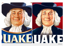
 Younger, thinner, more interesting looking is the new oatmeal look. After 136 years, the Quaker Oats guy logo has been updated to appeal to a new generation of young adults as well as appeal to age-phobic baby boomers. If you compare the two logos, yes the one on the right is the new one, the new one shows an updated font style too that is a brighter white and not "old timey" looking. According to the Time Magazine article, Quaker Oats owner PepsiCo introduced the changes in an effort to make the brand “fresh and innovative,” which might take a bit of doing, given that their product is a dessicated cereal grain. You may not be going on 136 years old, but when it comes to staying viable in the global talent marketplace, well then consider an update of your personal brand. How do you do that? Well it is less the wording in your content which focuses more on branding/rebranding. Rebranding positions you to move into new fields, business sectors, and industries. A brand refresh is gives your current brand a younger, more vibrant, newer, fresher appearance. That is more about image and look. At the warp speed of business and the Internet, a professional look evolves much more rapidly. Digital Documents in 2012 look different from those in 1998 Well, theoretically they should look different but some professionals are still using resume formats and layouts since before the faxed resume. Resumes, websites, blogs, or social profiles are built now to look great on a screen as that's where they are read. In fact, if you go to the Way Back Machine (Internet Archive) and check out early Linkedin, Amazon, blogs sites, you will see how different and dated they look now. The fonts now must take into consideration how well a font renders online and on a screen. Just look at the different in readability between the two Quaker Oats logos. Modern sans-serif fonts look younger and fresher. Serif fonts like Palatino render better onscreen than the traditional Times Roman, making for a crisper, fresher look. The layout and design of all documents are moving to a lighter, more open look. Just look at the new Google Blogger with dynamic, open blog that is image focused versus the blog you are reading now. The older you are, the younger your photo style Most executives use their photos provided by their company's PR department on Linkedin and for other business requirements. If you are over 50 and not working in government and financial services, this is not a good idea. More stable, traditional business sectors like seeing their executives in suits and business attire as does consulting services. There is a reason for the slang referring to "the suits". Using photos taken outdoors, in natural light, preferably in business casual will create an image of health, vitality and youth as well. Business formal creates age aura. If you have substantial career credentials and achievements, then you don't need to look the part as well. Take the photo one step further and be in dressy sports on a wind swept beach with a Golden Retriever. Lacking ocean, use a park and a poodle, or ski slopes, etc. Just don't look too much like you're into extreme sports. Remember how the category "interests" was put at the bottom of your resume and you got to list things like: biking, skiing, marathon running, etc etc? Well, one well done photos creates the better impression of you without the ubiquitous laundry list. Update your look, wardrobe, and appearance There is age discrimination and it is subtle, unconscious, and hard to prove when practiced in hiring and firing. In a media marketing driven, consumption based culture, we are manipulated by the image and look of products which are presented with an emphasis on sex, power, fun,and excitement. Yes, we like functional too, but we get sucked in by looks first. Think how many people wear those ergonomically uncomfortable, auditorially poor, and, basically, cheesy Apple iPod earbuds because they look cool and recognizable in white. A style makeover may not be annually necessary but every five years it is mandatory. This includes product: skin care, hair care, and body maintenance. There is a reason sites like Dermatologistrx is thriving online, and why both men and women no longer consider facial peels and lifts optional. It is not about looking younger which may be hard to archieve, especially after a certain age, but looking fresher, more vibrant and vital. The Quaker Oats guy looks thinner, healthier, and a bit younger and you should too!
1 Comment
10/16/2013 07:00:48 pm
Quaker is one of the leading brands in the market and Quaker Oats is one of their number one products. I also love their pop corn. It is good to read about Quaker Oats here and thank you for sharing this article o the public.
Reply
Leave a Reply. |
Categories
All
Archives
May 2019
Licensed by CC-by-SA
|